08.04.2019
Mit der Eröffnung seines eigenen Bioladens geht für Om - ein junger, innovativer laotischer Biobauer - ein langer Traum in Erfüllung. Die Idee: Frische Produkte in biologischer Qualität, mit deren Kauf die Community von lokalen Bauern und Kunsthandwerkern gestärkt wird. Frisches Gemüse direkt von der eigenen und einigen weiteren Farmen, Konfitüren, Tees, Töpferwaren, Seifen - das Angebot wird stetig erweitert. Und es kommt gut an: der Kundenstamm vergrössert sich und einige Restaurants in Luang Prabang arbeiten bereits mit der Co-op zusammen.
Die Innovationskraft, der Tatendrang und die positive Ausstrahlung von Om haben mich beeindruckt. Und so nahm ich die Mekong Co-op auf in mein kleines Projekt, das ich "Design+" nenne: Ich verbringe einen Teil meiner Zeit hier in Laos damit, ehrenamtlich oder zu tieferem Tarif kleine Businesses, Startups oder auch NGOs, die mich persönlich überzeugen, in grafischen Belangen zu unterstützen. Denn gerade zu Beginn haben diese oft kein Budget dafür, könnten aber ein einprägsames Logo, eine attraktive Broschüre oder ein spannendes Poster gut brauchen, um an Reichweite und Wiedererkennungswert zu gewinnen.
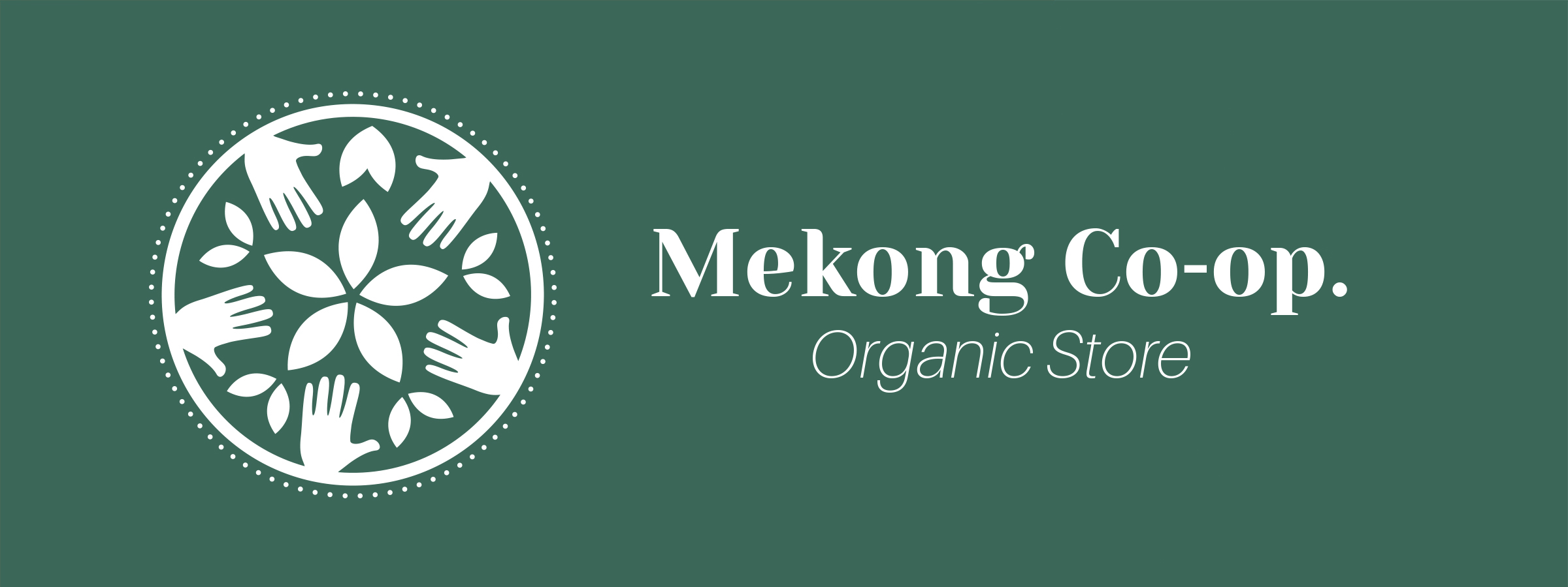
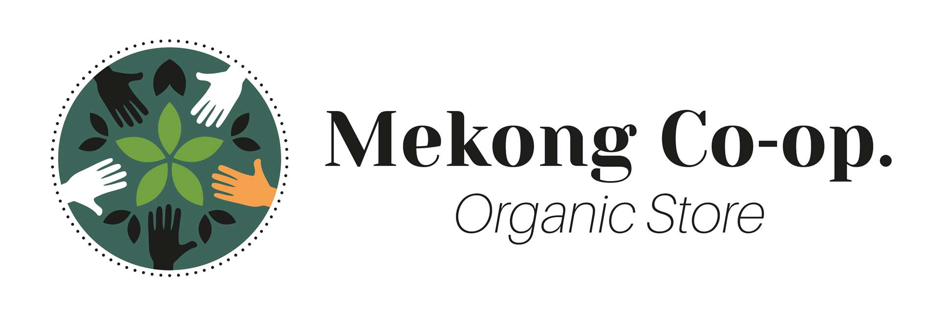
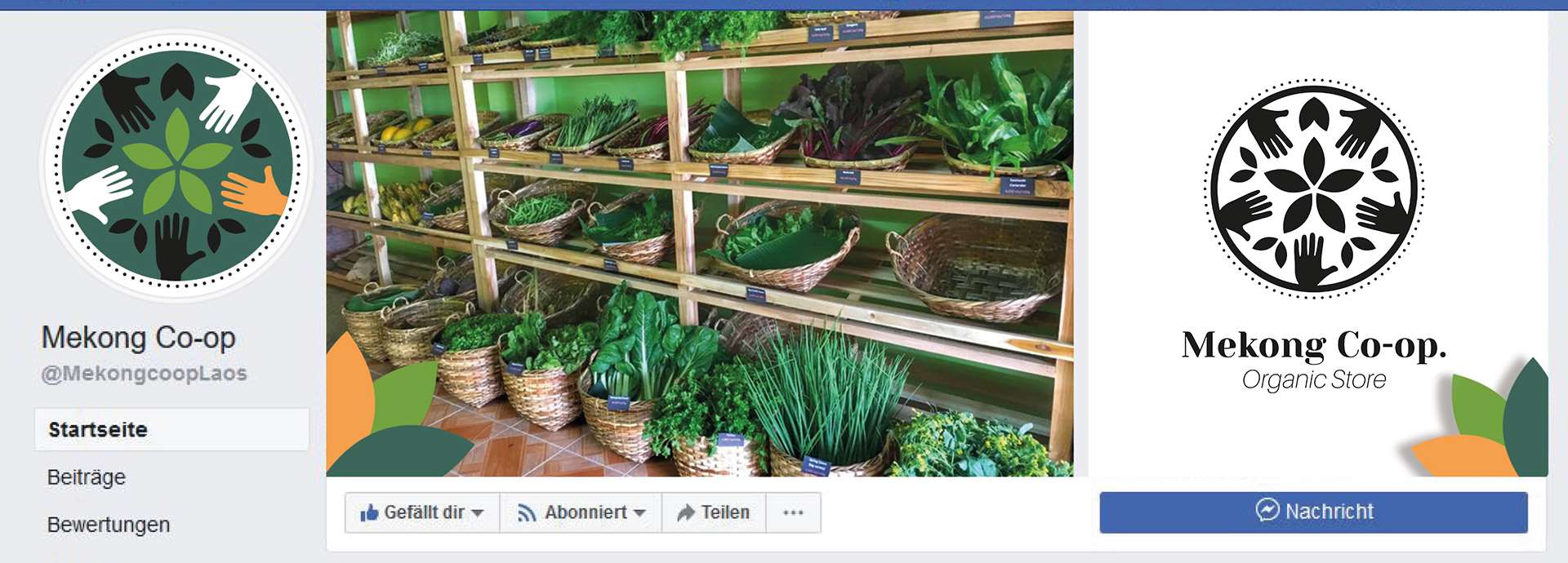
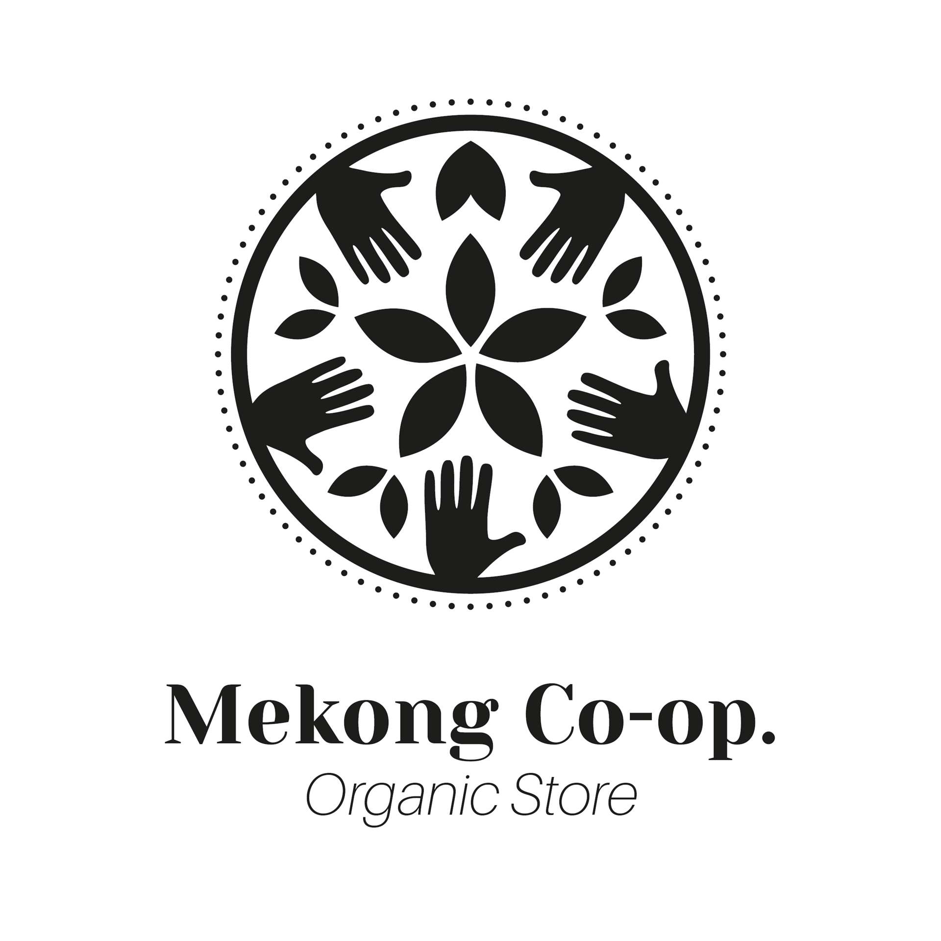
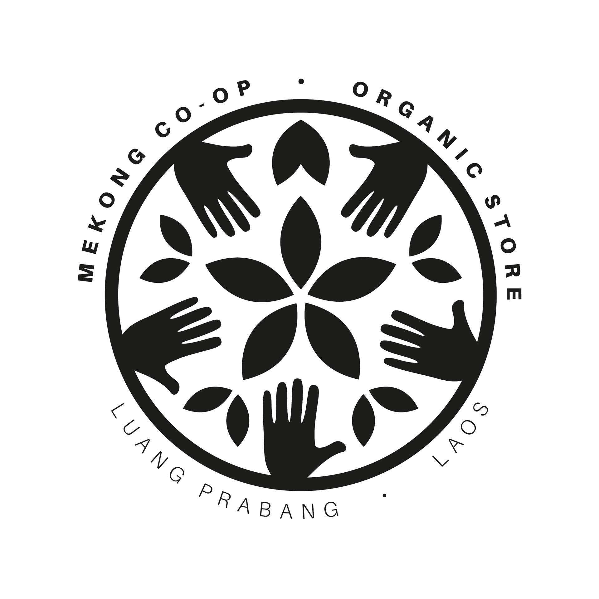
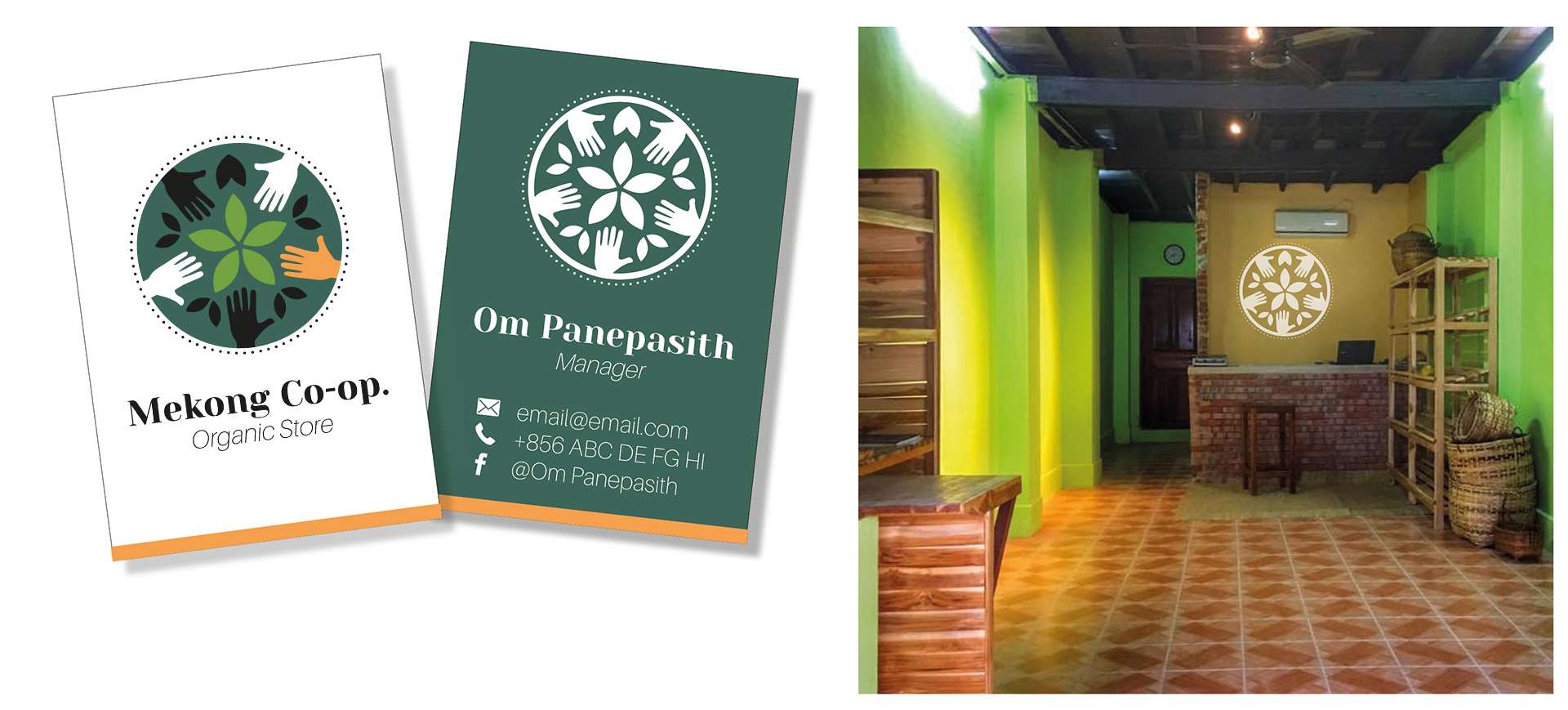
Für die Mekong Co-op kreierte ich ein Logo. Es verbindet den Aspekt der Community-Förderung (Hände) mit dem Aspekt der biologischen Landwirtschaft (Blätter) und ist eingebettet in einem Kreis (Kreislauf), der weitere Kreise ziehen soll (gepunkteter Kreis). Der erdige, orange Farbton steht für die rote Erde des Mekongs, das helle Grün für die Frische der Produkte, das dunkle Grün für den Dschungel, in dem alles eingebettet ist. Die Hände sind verschieden eingefärbt, was die Individualität der einzelnen Lieferanten und Teile der Community hervorheben soll. Angedachte, bzw teilweise realisierte Umsetzungen des Logos sind Facebook Header, Visitenkarten und eine Wandmalerei im Ladenlokal.
Update: Leider ist der Mekong Coop Organic Store mittlerweile geschlossen.
Opening his own organic store in Luang Prabang has been a long dream of Om, a young innovative laotian organic farmer. The idea: Fresh products in organic quality that empower the community of organic farmers and artisans in and around town. Fresh vegetables from the farms, jams, teas, pottery, soap - the product range is constantly being expanded. Customers are happy: more and more people are doing their groceries in the store and some restaurants purchase their ingredients from the store.
The innovative, entrepreneurial spirit and the positive vibes of Om impressed me. And so I offered him to be part of my little project that I call "Design+": I spend a part of my time here in Laos supporting on a voluntary basis or for a lower fee small businesses, startups or NGOs that don't have a budget for design work yet but who could use some help with graphics. Having a nice logo, an attractive brochure, or posters that make people curious can be essential to be able to grow, to reach the right audience and to be recognized.
For Mekong Co-op I created a logo. It incorporates the aspect of community empowerment (hands) as well as the aspect of organic agriculture (leaves) and is embedded in a circle that has an impact (second, dotted circle). The earthy, orange color represents the rich fertile soil of the Mekong banks, the bright green for the freshness of products, the dark green for the jungle where many of the farms are located. The hands are designed in different colors, which symbolizes the uniqueness of the single community members. Further, not yet or partly realized implementations of the logo are: facebook header, business cards, and a mural in the store.
Update: Unfortunately, the store has been closed in the meantime.
copyright © 2024 oikeo projects